Page 1 of 3
Logo Suggestions, New Ideas
Posted: Thu Feb 19, 2015 10:25 pm
by ERIC
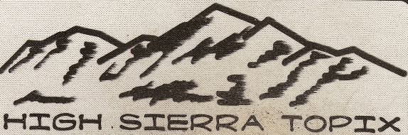
I admit that graphic design is not my strength. I'm sure by now you've seen the latest version of the HST logo, but rest assured its design is not set in stone! I'm interested in simple, timeless design ideas - simplicity and scale-ability are key. No shadowing, and probably no more than about 4 colors and something that could be distilled down to a single color if desired. Examples of some logos I like would be REI, The North Face, Marmot, MSR, Mountain Equipment Co-Op, SectionHiker.com, etc.
Having said all that, what can we do to make the current logo better, or, how would you describe what you believe could be the perfect logo for HST (BTW you are allowed to ignore my criteria)?
Re: Logo Suggestions, New Ideas
Posted: Fri Feb 20, 2015 12:23 am
by gary c.
Eric, I've done some t-shirt designs before and I'll try to find the time to dink around a little. I like to do things more as a single color with a silhouette design.
Re: Logo Suggestions, New Ideas
Posted: Fri Feb 20, 2015 7:38 pm
by ERIC
Thanks so much, gary c.!
Attached is the ai file for the current logo, in case you or anyone else find it useful.
Re: Logo Suggestions, New Ideas
Posted: Tue Mar 03, 2015 12:25 am
by Hikin Mike
I'm not a graphic designer either, but I have some experience with designing....if you still need a logo.
Re: Logo Suggestions, New Ideas
Posted: Tue Mar 03, 2015 8:30 am
by ERIC
Hikin Mike wrote:I'm not a graphic designer either, but I have some experience with designing....if you still need a logo.
Thanks, Mike! Yes, your help would be very much appreciated. Some on here may recall you did a really nice job with the graphic(s) we still use on the CafePress merchandise.

Even if someone is not a graphic designer suggestions are welcome. Not going to please everyone but would be good if we could come up with something that's appealing to the majority.
Re: Logo Suggestions, New Ideas
Posted: Tue Mar 03, 2015 6:47 pm
by Hikin Mike
I always liked the little icons from the T-shirt/Cafe Press stuff, so I through something together...
Re: Logo Suggestions, New Ideas
Posted: Tue Mar 03, 2015 7:09 pm
by rlown
Nice logo's! I too like retro, and this comes to mind (sorry that the mouse pad is a little dirty: )
- HST retro.JPG (48.13 KiB) Viewed 4902 times
If this was sprayed with an alpine glow (markskor?) it would be spectacular.
Just an idea..
Re: Logo Suggestions, New Ideas
Posted: Tue Mar 03, 2015 7:40 pm
by ERIC
If you mean something along the lines of digitized watercolor, Russ, you've definitely got my attention!
Again, just keep in mind that the logo needs to be something that can be scale-able - think 80x80px-ish on up to bumper sticker or banner size - and look good at any size in between. Additional text can be added to the logo at larger sizes, but at smaller sizes ideally it should be unique and identifiable (think small patch on your backpack, etc.)
Re: Logo Suggestions, New Ideas
Posted: Tue Mar 03, 2015 7:50 pm
by ERIC
Here's another mock-up that I received. It arrived after I'd already contracted what we have now. Still not what we want (I don't think) but gives an example of what I mean by logo (small scale) and logo plus text (large scale). Plus, the logo itself is somewhat distinguishable.
Re: Logo Suggestions, New Ideas
Posted: Tue Mar 03, 2015 8:01 pm
by rlown
banners and bumper stickers? you have those? I could cut out the same pic from my old mouse pad and it would weigh an ounce. but that latest thing you got looks quite corporate. not saying that's good or bad.